
Data is almost everywhere we look. We can find data easily. It can be right in front of our eyes. To make sense of any data or to put data to work. In the field of data analysis, day-to-day data to more complex data are analysed to prove our thinking and ideas and answer questions with the data.
To look at data more closely, it is necessary to understand data analysis, statistics, and some of the maths elements behind data analytics. In this blog post, we are looking at a simple linear regression model as this is an excellent place to start with more complex aspects of data analysis. Simple Linear regression models are statistical models that use two variables and are less complex than other similar statistical models. This is a good place to start looking into data analysis more closely.
The blog post aims to give a broad outline of the working of examining a hypothesis research question using a simple linear regression model with explanations of the data analysis-based research.
Why Use Simple Linear Regression To Analyse Data?
The Data Practioner working in the marketing department on the company’s social media channels would conduct competitor analysis of other social media channels and be a good place for data analysis. For example, a marketing Data Practioner would like to answer questions through their data experiments, such as testing the popularity of competitor social media channels within users and testing if competitors’ metrics are as expected. A linear regression model can help to determine some answers to these questions.
The Simple Linear Regression Model
Simple Linear regression can produce analysis such as statistical significance and make predictions about the data from the data used in the model. Statistical significance shows that data is high-quality and rich, so individual and unique, and could not be reproduced easily. Predictions from data are made by calculating the means within the data set to predict the dependent variable.
The simple linear regression model is based on two variables. Therefore, the hypothesis should be designed with two variables. In this case, the experiment is based on the social media accounts of international news organisations. What the experiment is analysing is the social media metrics of the news organisations: Are the number of Instagram followers and Facebook likes are directly influenced by each other? This data is taken from social media accounts accessible to the public. The news organisations were randomly selected and inputted into the table.
| Y variable Facebook Likes | X variable Instagram followers |
| 58000000 | 22900000 |
| 18000000 | 15900000 |
| 34000000 | 18100000 |
| 6600000 | 4300000 |
| 9900000 | 1500000 |
| 13000000 | 2700000 |
| 8400000 | 5200000 |
To explain, ‘followers’ and ‘likes are indicators of the social media pages’ overall popularity. The higher number, the more popularity the news organisation has with social media users.
Hypothesis
For example, below is a hypothesis that fits into a simple linear regression model:
There is no link between the social platforms of Instagram and Facebook popularity metrics of Instagram followers and Facebook likes of international news organisations’ social media accounts.
The outcome of the linear regression model would be two options.
A) Null hypothesis accepts the existing believe or claim. H0
Or B), Alternate hypothesis, the alternative hypothesis is believed to be accurate or proven. H1
Independent and Dependent Variables
What are Independent and Dependent Variables?
Dependent variable = Y (dependent another variable). The thing we want to explain
Independent variable = X (we already know about), the factor that might influence the dependent variable.
In our experiment, the (Y) dependent variable in this linear regression model is the number of Facebook likes from each news organisation’s Facebook page,
The (X) Independent variable in the linear regression model is the number of Instagram followers from each news organisation’s Instagram page. In making predictions, the data will come from the Y variable.
The Linear Regression Equation
The symbols explanation
Yi = dependent variable
f = function
Xi = independent variable
ß = unknown parameters
ei = error term
Pseudo equation
Facebook Likes = slope * Instagram Followers + intercept
The Analysis
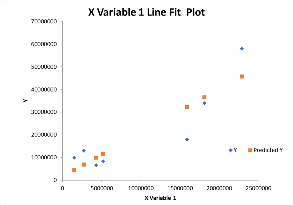
To produce the simple linear regression model. Microsoft Excel was used to calculate the model. Below, image 1, is the output tables from the model. Image 2 is the line of the best-fit graph of the Y variable.
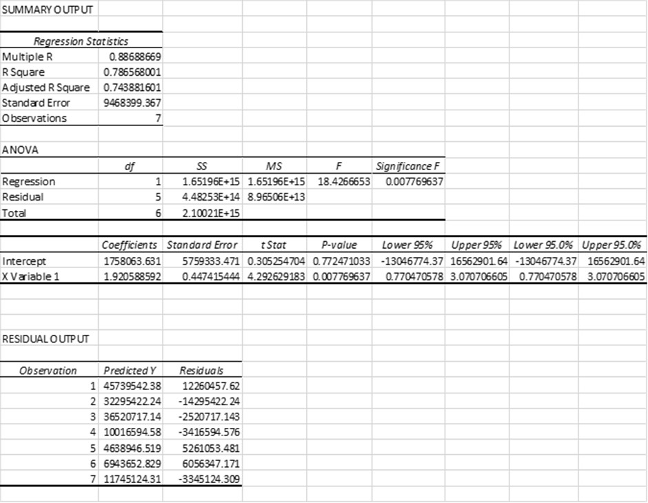
Explanation Of Summary Output Table
Multiple R shows the linear relations in terms of strength. A 0.65 p-value, for example, is a significant value because it is low and suggests there is less chance of the test being repeated. This score in the model comes to 0.86 relatively strong value.
R2, or the coefficient of determination, shows how the variance of the dependent variable accounts for the independent variable. For example, a score of 0.43x 100 = 43%. The other 57% are measurement errors. Here from this model, it is 79% and closely tracks the y variable. An R2 between 0 and 1 indicates how well the predictor variable can explain the response variable. For example, an R2 of 0.2 indicates that the predictor variable can explain 20% of the variance in the response variable; an R2 of 0.77 indicates that the predictor variable can explain 77% of the variance in the response variable—the goodness of fit.
R2 computes the proportion of the variation in y explained by the model’s systematic portion (i.e. by the β’x).
R2 = 0, our model doesn’t explain anything
R2 = 1 our model explains everything
*Adjusted R2 is the number of independent variables in the analysis and corrects for bias— more useful for IV with multiple regression variables. However, more can be more accurate in this case than R squared.
The Standard Error is the average distance of values that observed values fall from the regression line. The smaller the error, the more accurate the regression analysis is. In this case, the values fall an average of 93%, 9468399.367 units from the regression line. The Standard error also shows how well the model fits the research question. * This value is suited to logistic regression.
ANOVA analysis show variance in the model between the means and residual values.
Regression statistics: the variation in the means and how well the model explains the variation in the data.
Residual output: shows the values predicted by the model between the means of the dependent variable.
Degrees of freedom (df)
Regression df is the number of independent variables in the regression model.
Residual df is the total number of observations of the dataset subtracted by the estimated number of variables.
Sum-of-squares (SS) is the sum between the n data points and the grand mean. As the name suggests, it quantifies the total variability in the observed data.
Regression SS from the ANOVA table, the regression SS is 16%, and the total SS is 21%, which means the regression model explains about 16 to 21 (around 21%) of all the variability in the dataset.
Residual SS From the ANOVA table, the residual SS is about 44%. In general, the smaller the error, the better the regression model explains the variation in the data set, so we usually want to minimise this error.
Total SS is the sum of regression and residual SS or by how much the chance of admittance would vary.
Mean squared (MS) is used to determine whether factors are significant. The mean square is obtained by dividing the sum of squares by the degrees of freedom. The mean square represents the variation between the sample means.
F Ratio = Regression MS / Residual
Each F ratio is calculated by dividing the MS value by another MS value. The MS value for the denominator depends on the experimental design.
Significance of the two set variables measures if there is the statistical significance with each other; if so, the data is unique and would not be easy to repeat. 0.0077.69
Y Intercept shows the mean value response fitted line crosses the y-axis.
X variable is the values that are predicted in the model.
Coefficients show the weight of a variable towards the model. It gives the amount of change in the dependent variable compared to the independent variable. A positive regression coefficient shows that the variables have a relationship. Negative regression coefficients show that the variables have a weaker relationship. The intercept in a regression table shows the average expected value for the independent variable when all predictor variables are equal to zero.
Standard Error (ANOVA Table) provides the estimated standard deviation of the distribution of coefficients. The amount of the coefficient varies across different cases. A coefficient much more significant than its standard error implies a probability that the coefficient is not 0.
T-test/T-test T-Stat = Coefficients/Standard Error
Shows how significant the differences between means are. A large t-score, or t-value, indicates that the groups are different, while a small t-score suggests that the groups are similar.
P-value there is a statistically significant relationship with p-value P-values below <5%. The null hypothesis can be rejected. Low p-values indicate that your data did not occur by chance.
The p-value shows how likely the observed data will have occurred under the null hypothesis.
If the p-value is below your significance threshold (typically p < 0.05), the null hypothesis can be rejected, but this does not necessarily mean that your alternative hypothesis is true.
Upper/lower 95% if a data point falls outside these lines, you are 95% sure there is something special about it. Rule of thumb: if 0 is outside our 95% confidence interval, we can claim there is a statistically significant relationship. By accepting the alt-hypothesis, we are taking their association.
Residual output is the distance between the data point distribution and the line of best fit. The residual output gives relationship strength output—residual plots uniformity of variance, calculating how random the patterns are with the distribution.
Explanation of Graph
Line Fit Plot, the sequence of the best fit plot suggests the predicted value near the actual values. The graph represents the relationship between the two variables based on the data distribution in the chart. Probability is found in focusing on the mean in the data set.
Summary Of Experiment
By analysing the data, the experiment shows that there is a strong link between social media popularity social media of international news organisations. The Instagram followers (X variable) metric is linked to (Y variable) Facebook likes.
The parts of the test that point towards accepting the alternative hypothesis (H1)
The line of best fits on the graph shows a close relationship between the two variables.
Other key values show that the variables have a relationship.
P- value 0.7724
T-test 0.3052
Significance 0.0077.69
What Other Conclusions Can Be Taken from The Experiment?
From a business or marketing view, evidence suggests that the popularity of the two social platforms is legitimate to support further analysis.
A decision about the popularity of either platform could be made from the analysis of the experiment. From the data sample, Facebook does have a larger user base than Instagram, the experiment suggests the metrics of the popularity of the two platforms are linked and have a relationship. This may seem too simplistic, but the link between the two variables says the smaller user base of Instagram influences the larger user base of Facebook. Therefore, Facebook has a larger user base than Instagram across the sampled news organisations in the first glance and in the analysis.
